

 English

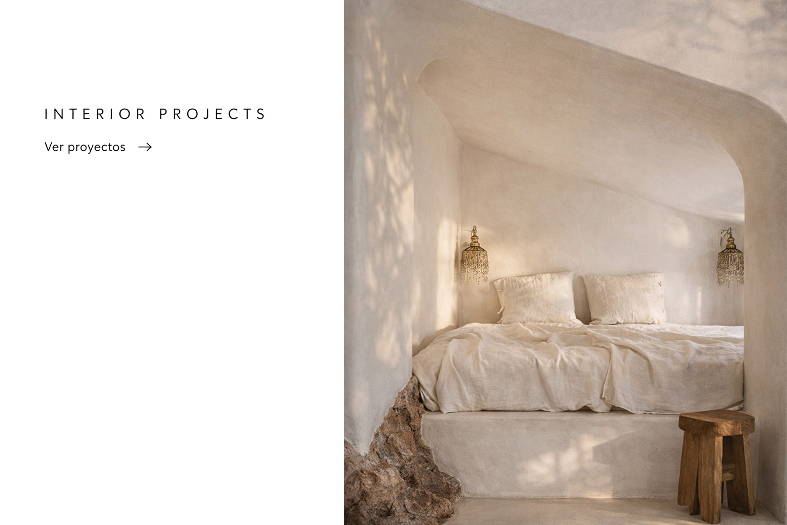
Spring wallpaper as therapy for a positive home
- MIV Interiores
- 1829 likes
- 6573 views
- 1 comments
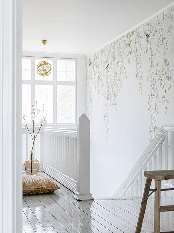
About to arrive the month of flowers, May, the most spring-like and colorful of the whole year, in Miv Interiores we are already thinking about how to get the house ready, creating a fresh, bright and positive environment.
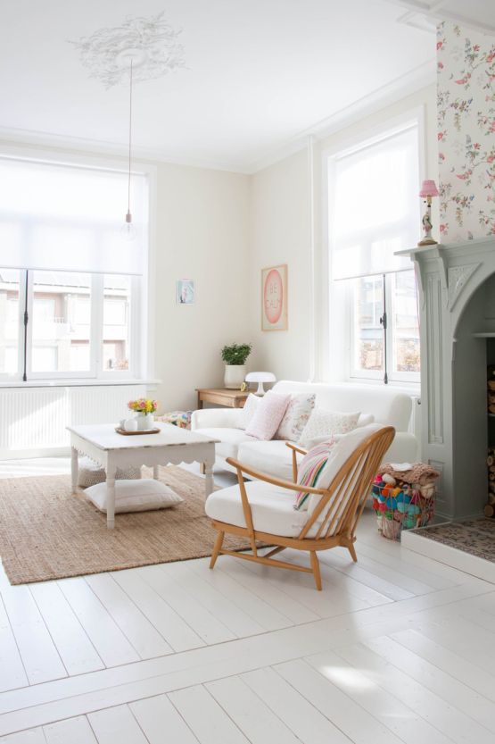
As far as home decoration is concerned, we can make small changes throughout the year and achieve great effects on a visual level and even on our mood, it is not necessary to change the living room from top to bottom or invest in a new kitchen, it is enough with small details that help us feel that the atmosphere of our house adapts to the different seasons of the year and to feel that the different rooms change and are renewed, as we do with our wardrobe. To make our house smell like Spring, the great trend of the season is to dare with wallpapers on the walls, colorful, with spring prints and matching the environment.
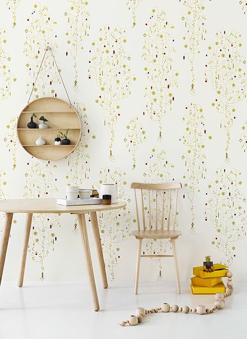
How to choose the most suitable paper?
The choice of colors.
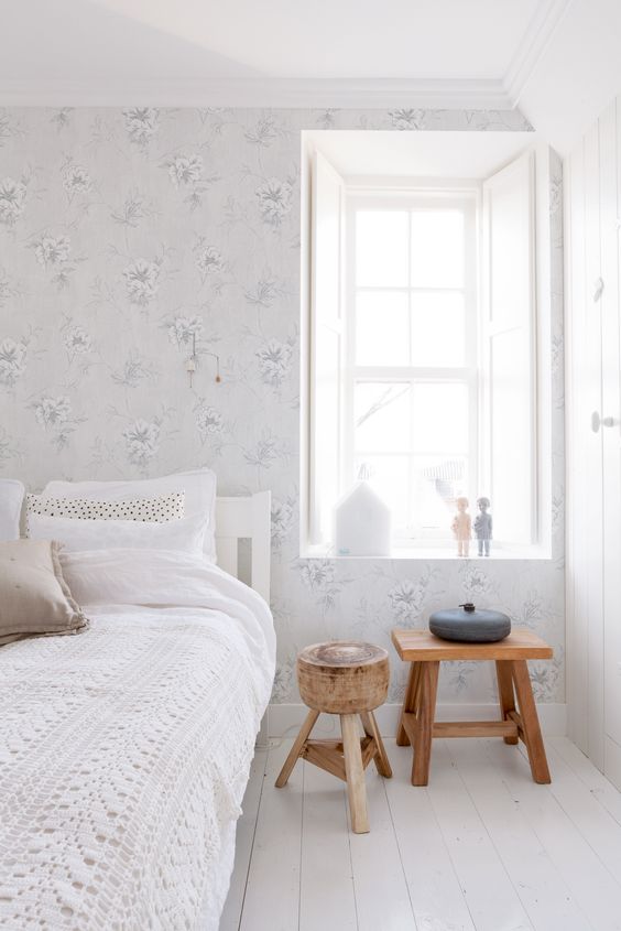
We have to opt for lighter colours for rooms where we are looking for calm and tranquillity, such as the bedroom or the office and for bright tones in the rooms with more activity in the house.
The size of the room.
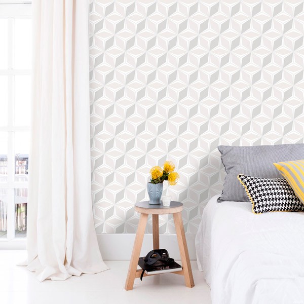
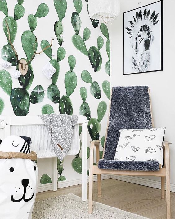
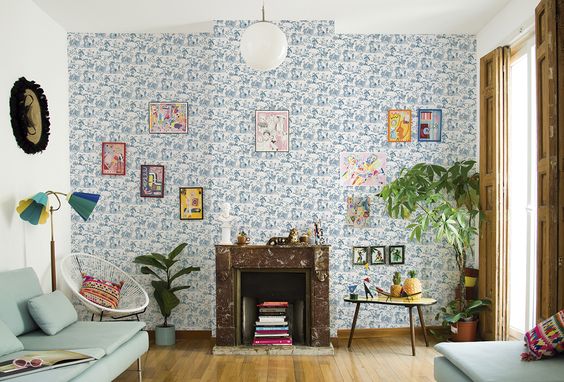
A key factor, in this sense, we will choose a larger pattern for large rooms and a smaller one for smaller rooms. Of course it is not necessary to cover a room from top to bottom, it will be enough to choose a single wall that breaks the monotony of the room, thus creating a focus of attention somewhere that we want to give greater prominence, we can frame a reading corner, the dining area, etc..
Merging our wallpaper with the rest of the furniture
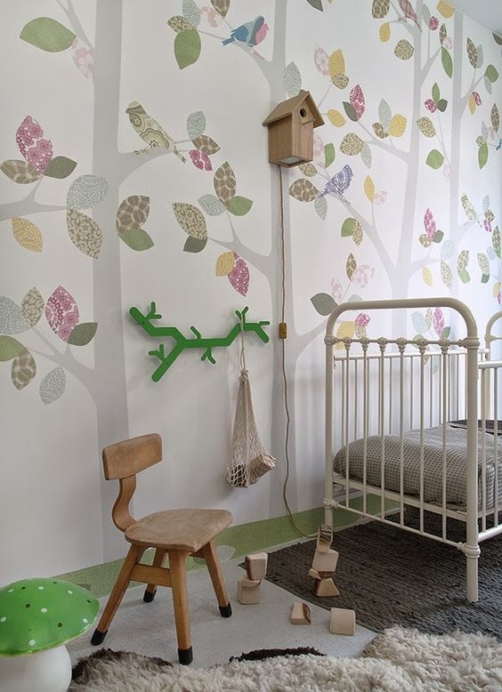
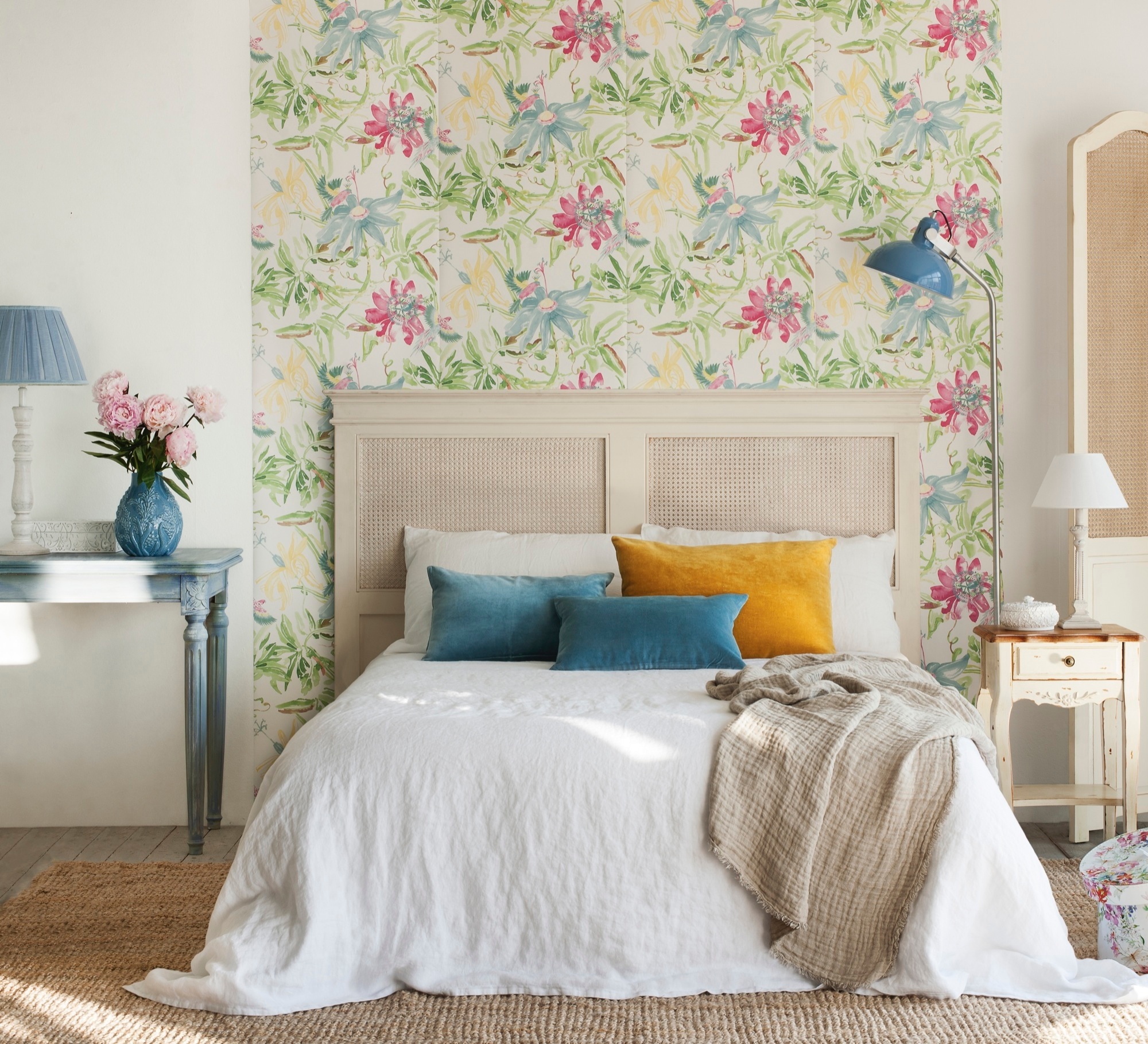
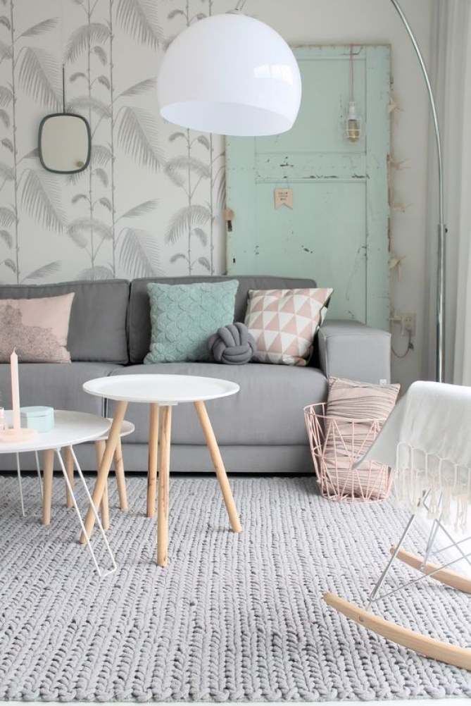
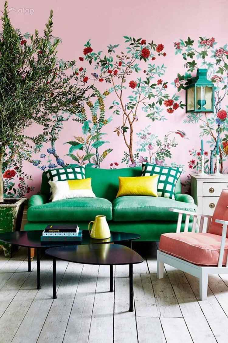
To create harmony and that our wallpaper is connected to the decoration of the rest of the room, the ideal is to choose one of the colors of the wallpaper and look for a decorative element (vases, cushions, curtains...) to "mimic" the wallpaper with the decoration of the room.
.jpg)
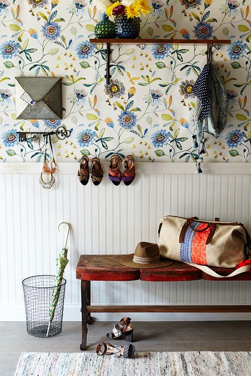
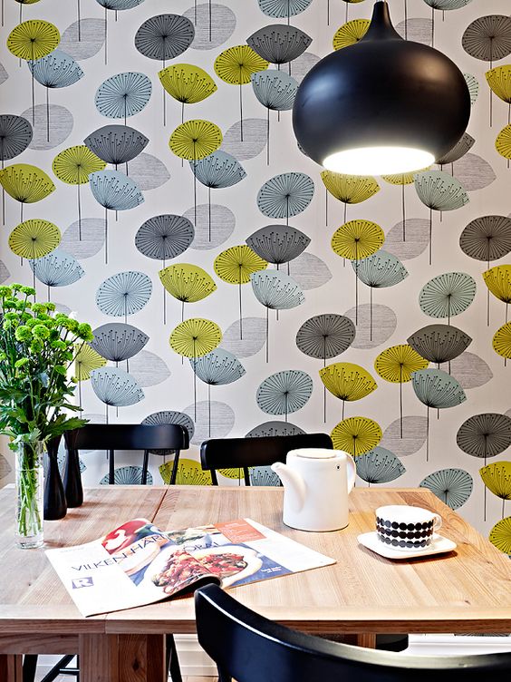
If you are a daring person you can choose the main color of the wallpaper and look for an opposite color and this color is the one that will correspond to a piece of furniture.
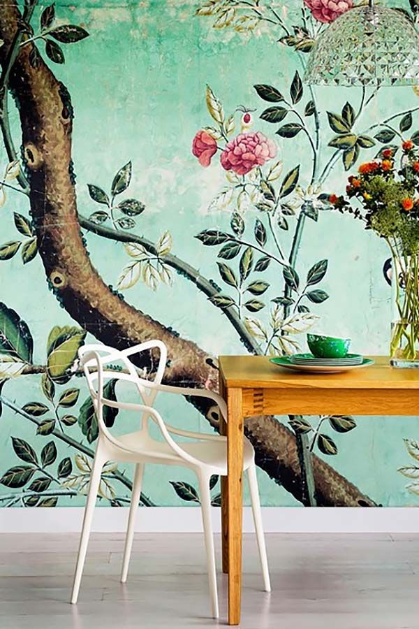
For example; A wallpaper that has turquoise blue as the predominant tone, where we want there to be a buffet, this could be orange or wood.
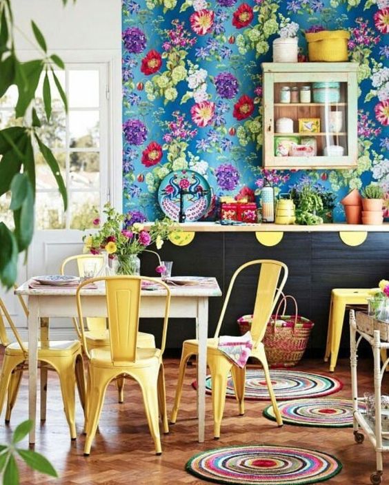
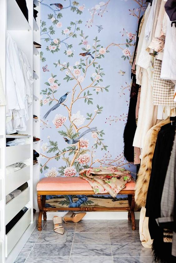
Another nice effect is to look for a more intense tone than the main one on the wall and place a bench, for example, upholstered with a fabric of the same tone but of greater intensity.
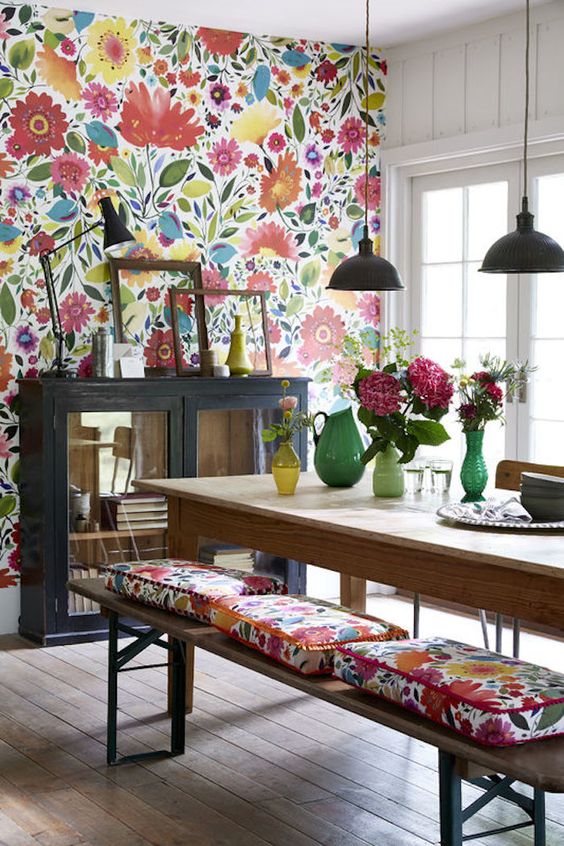
Complementary colors and prints.
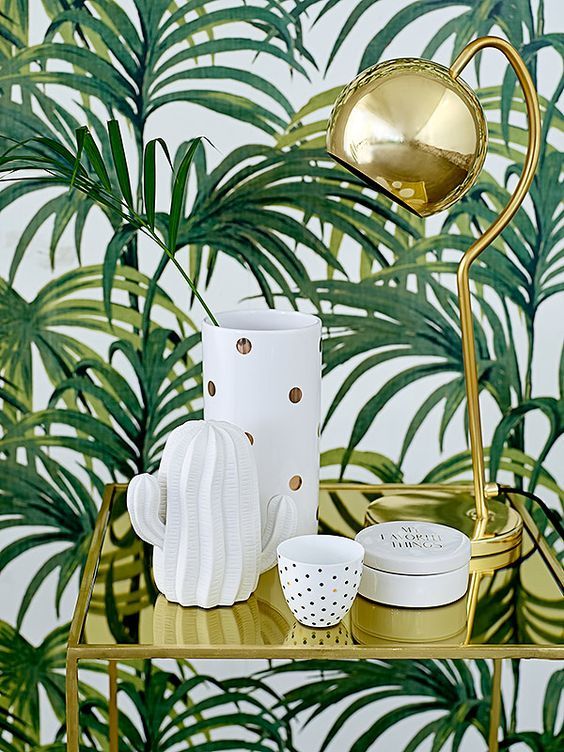
We can also be guided by the motif of our paper, not only by the color, for example if we decide to cover one of the walls with paper in green tones with drawings of green flowers or plants, we can take advantage and choose covers for the sofa cushions with the same pattern, very fresh and youthful 'jungle' motifs that will become a connecting element with our lined wall.
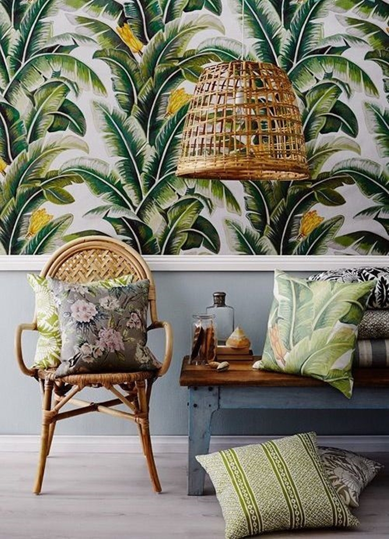

Prints according to the season
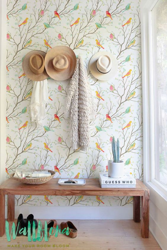
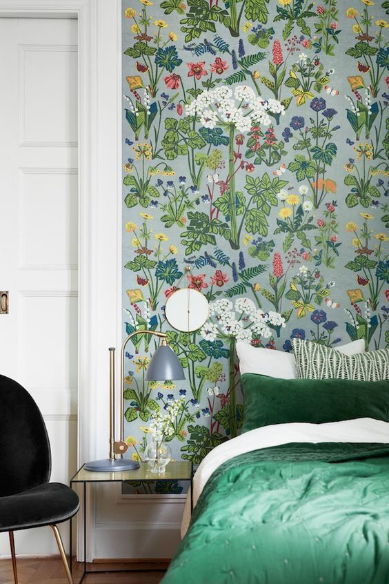
In addition to being guided by elements that fit with the decorative style of our home, we can take into account the time of year, on this occasion the idea is to welcome Spring inside our home, so floral motifs, colors that allude to nature, cheerful and vibrant motifs are always the best option to break with the colder tones of winter.
Wallpaper and alternative uses
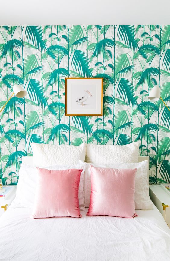
Because the rules are sometimes to be broken, so why not use wallpaper for other things than just lining a simple wall? For example, we can use it in the bedroom as a headboard, although there are many other alternatives, a matter of giving free rein to our imagination.
Via.
Comments (1)